DIRECTION 01
Expressive Serif × Sun
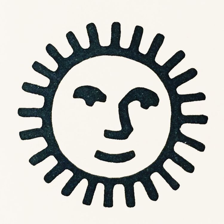
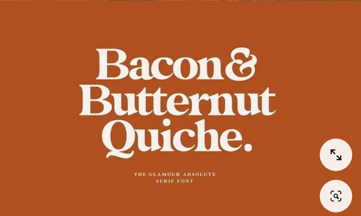
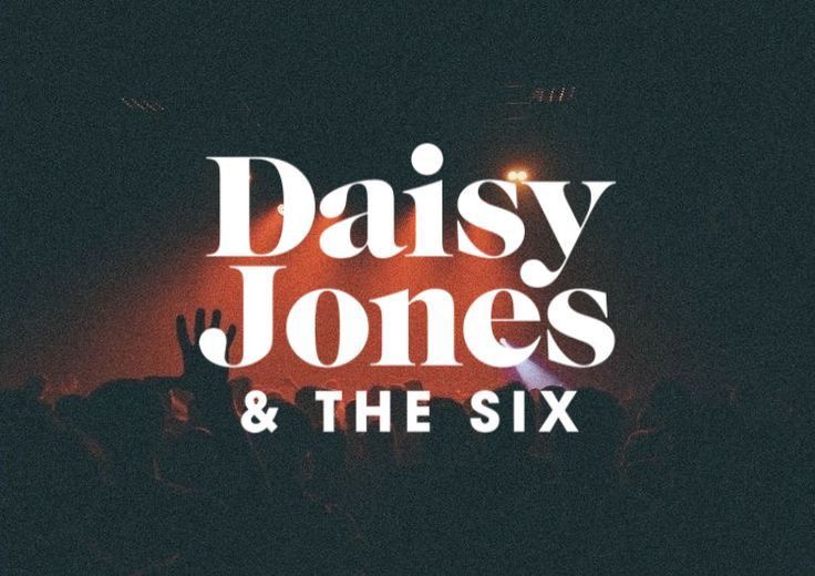
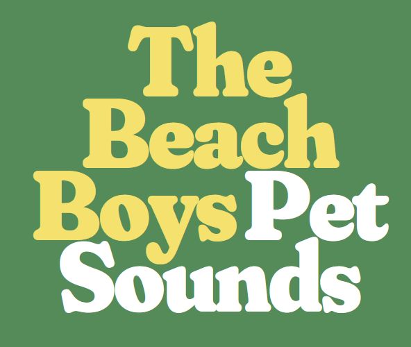
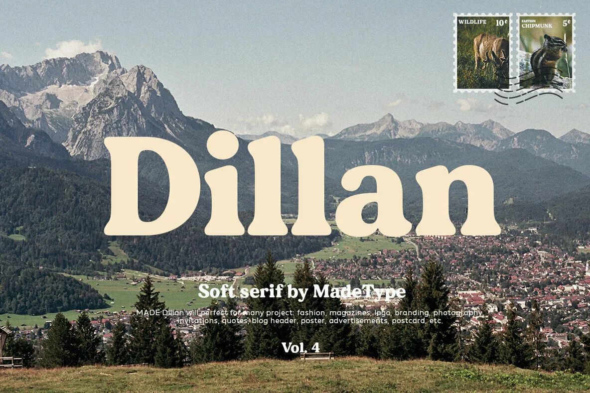
The logotype leads. A soft, expressive serif in the spirit of the 1960s and 70s, worn in and a little dreamlike, carrying history in its bones without trying to feel established. The sun is an optional addition, a secondary mark that pairs with the logotype in a lockup when one is wanted. It nods to warmth and light without being literal.
FeelSoft, expressive, vintage, timeworn
In the spirit ofNewport Folk, Austin City Limits
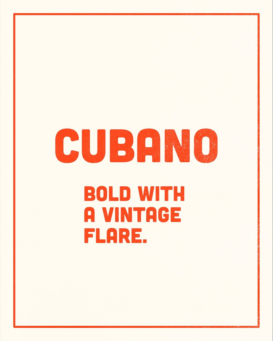
Type styleA softer serif font & expressive lettering
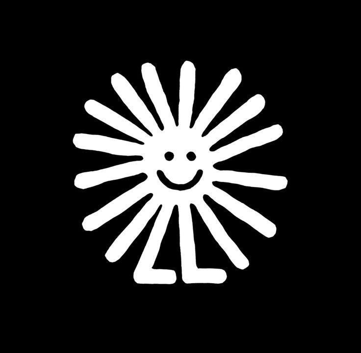
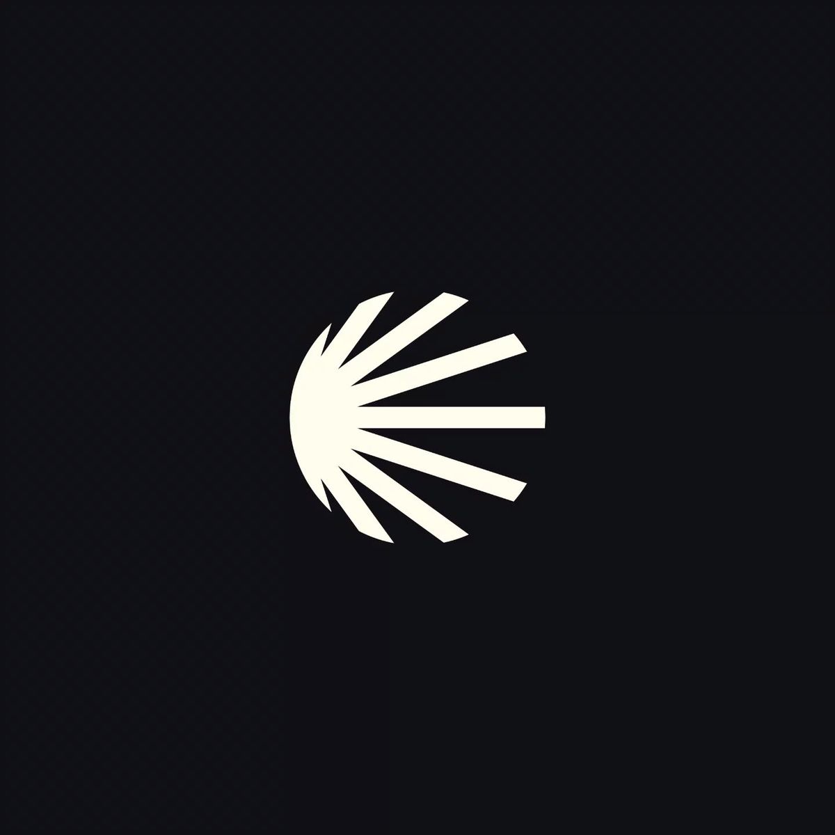
Icon — SunWarmth and light